
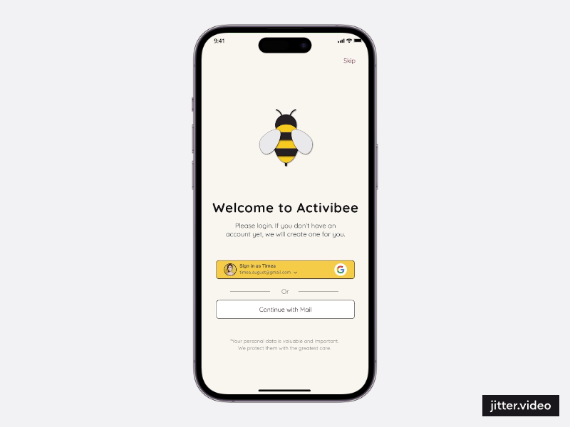
From Missed Deadlines to Confident Clicks
UX for the Everyday hero: A Parent

ROLE
Product Designer
Visual Designer
SKILLS
Wireframing
Prototyping
Usability Testing
TIMELINE
Q1 - Q2 2024
A QUICK SUMMARY
Making After-School Planning Easier
— Start to Finish
This project aimed to simplify activity booking for busy parents. I designed a mobile app, tested it with 10 users, and iterated based on their feedback. This was my first full UX project.
If you’d prefer to see the case study in a different format, a slide deck version is available.


THE STORY
Timea’s daily routine circle
Timea is a mother of two and works full-time. Evenings are a blur of dinner, homework, and to-do lists. In between, she tries to find after-school activities for her boys. But most offers are scattered across different websites, without a unified booking system. She often misses sign-ups—not from lack of interest, but because of chaos.
“How might we help parents like Timea book activities for their child in under 2 minutes—without stress or phone calls?”
THE PROBLEM
In Slovakia, most extracurricular activity sign-ups are manual: emails, paper forms, or calls. As part of the Google UX Design Certificate, I was tasked with designing a mobile app to streamline the booking process.
Points I´ve focused on:
How to make the booking stress free?

Helping parents save time

Making activity discovery intuitive

Reducing friction in
the booking flow
MY SOLUTION
Three design decisions that empowered parents
Fast onboarding
Parents can add a child immediately during onboarding, making the app usable from the first minute.

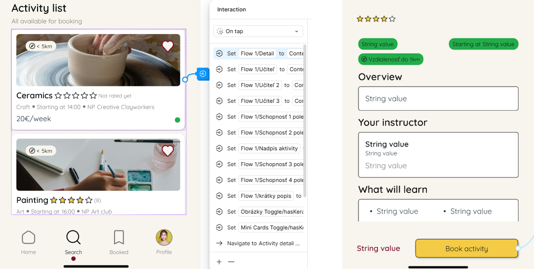
Clear activity feed
Activities can be browsed by time, interest, and availability. Working parents ranked “time compatibility” as most important.
More details meant bigger cards and less room to show them. This lead to implementing scroll interaction to remove unnecessary items.


Rethinking the homepage
After first testing series, I changed the homepage layout. Users misread the “Booked Activities” section as a way to start a new booking.
TESTING PHASE
Overcoming my introversion
I conducted two rounds of moderated usability testing (5 users each), entirely in Slovak - one after completing the first prototype and second during the time I´ve worked on visuals for the app. Both studies helped ensure clear, natural feedback.
Personally, this phase was a milestone. As an introvert, I had to step out of my comfort zone to lead live conversations.
Quotes destilled from 2nd case study
“It became my small personal victory—I realized that curiosity and empathy beat nervousness.”
Key changes
Three flaws from my initial thinking

Skip the onboarding?
A surprising finding: Three out of five users wanted to explore activities first, not set up a profile. This changed how I structured onboarding.

Flawed activity feed
Fixing key flaw - misreading the “Booked Activities” section as a way to start a new booking moved the design in the right direction.
The second round of testing revealed something new — three out of five users struggled with the layout of the activity cards that caused more questions that answers.
It became clear the cards needed to be cleaner and easier to scan.


Booking flow friction
The first usability study revealed friction in the booking flow. Four out of five participants found the copy unclear and suggested improvements.
Two users also struggled with how to select a child — the dropdown felt unintuitive, and there was no way to add a new child during the process.
Another point of frustration was the time selection, which lacked enough detail to help users choose with confidence.
PROTOTYPING LESSONS
How things can go sideways quickly
Working in Figma for the first time taught me what happens when things fall apart and the speed of it.
Splitting my work into pages — wireframes, design system, prototype — led to unexpected issues: broken links, dead ends, and screens that didn’t behave as intended.
At first, I saw it as technical friction. Later, I realized it exposed missing logic in my design. These breakdowns were frustrating — but they helped me shift from building screens to thinking in systems.
“It was like chess—every click had a consequence three moves later.”
Reducing the screens
At the same time, I learned how to use Figma’s local variables to create smart, scalable interactions — without duplicating a hundred screens.
This shifted my thinking: from designing clickable screens to building dynamic systems.
I used this approach to simplify the booking flow by filling 16 variable fields — all triggered by tapping a single activity card.
Even image visibility was controlled through variables, giving the illusion of smooth, native-like navigation.
THE RESULT
From Broken Flows to Confident Clicks
I made a lot of mistakes building this prototype. Some were small copy issues, others broke entire flows. But with every round of feedback, I learned to simplify, test, and rethink.
The final result could gave parents a smoother experience — and gave me the confidence to trust the UX process.
I suggest to try the prototype for yourself.
REFLECTIONS
From Sales to UX
This was my first complete UX project — and also my first step away from a career in sales. For over a decade,
I worked in roles where success depended on understanding people’s needs, solving problems quickly, and building trust. UX felt like a natural next step — but I had to learn to slow down, listen deeply, and embrace iteration.
I learned that great ideas don’t always come first. They emerge through mistakes, feedback, and refinement.
And that’s what I love about UX: it rewards learning, not perfection. My next steps will at first lead towards my second project for this certificate.