Journey from one suspicious metric to redesigning a key conversion point
Minute and a 20 question marks
ROLE
Product Designer
Visual Designer
SKILLS
Wireframing
Prototyping
Usability Testing
TIMELINE
Q2 2025
A QUICK SUMMARY
When data didn’t match behavior
While working for an e-commerce company, I noticed something strange:
even logged-in users were spending over a minute in the checkout.
That sparked this case study.
It began as an attempt to speed things up — but through a heuristic review and a closer look at user behavior, I realized the problem wasn’t speed.
It was Confidence, Clarity, Control.
I led the full redesign process: research, analysis, UI structure, prototyping, and testing with a goal to present the result to the manager.
The result is a modular, testable prototype that rethinks how checkout should feel.
⏭️Prefer to skip the deep dive?
THE HYPOTHESIS
What I Expected…
I’ve spent a lot of time with this e-commerce platform — I know how checkout should behave, and how it usually performs.
So when I saw that even logged-in users were spending more than a minute in the final step, I assumed something had gone wrong.
My Hypothesis:
“There’s a friction in the interface — and it’s costing people time.”
Maybe…
…something was unclear.
…the layout wasn’t helping.
…people simply didn’t trust what they were seeing.
RESEARCH AND UX AUDIT
…And What I Didn’t Find
To test this, I first ran a SWOT analysis to map strengths, weaknesses, and potential causes.
Strengths.
Hierarchy of steps
Mobile Responsivity (Limited)
Hover animations
Weaknesses.
Linearity
Does not remember alternative addresses
Forces user to re-edit invoicing details
Then I moved forward with two methods with a combined goal to uncover dificulties both from a user and professional perspective.
Together, they revealed a different story.
User Interviews
5 new and 5 reccuring customers
7 questions mapping users behavior
Qualitative method via phone call
Opportunities.
Contrast of elements
Simplifying the steps
Text hierarchy
Possible VIP customer behavior
Slower flow of steps
No visible signal of completing the step
Unclear way to return to previous step
Heuristic UX audit
Jakob Nielsen´s Heuristics for UI
Manual checkout test
Notes from users comparison
Threats.
TALKING TO USERS
“The time spent on checkout ranged from a few seconds to 2-3 minutes according to respondents.”
Reading Between the Lines
No major blockers were reported.
But hesitation showed up in behavior — subtle pauses, repeated reading, last-second adjustments.

HEURISTICS COMPARISON
What People Didn’t Say
System status visibility
User control and freedom to go back
Recognition rather than Recall
Minimalist design
Error prevention
Real world match
Consistency and Standards
Flexibility of use
Help Users Recognize, Diagnose etc.
Help and Documentation
Five major flaws revealed by the audit:
Problematic visual hierarchy
Limited/Poor mobile optimalization
Linearity of steps/No obvious way to go back (Update: Text based Back button, barelly visible even in company red color)
Missing help fields
No way to return to previous step after going back to eshop
These details weren’t obvious failures — but they explained the time.
Not a technical friction. Cognitive friction.
THE PROBLEM
Not a Technical Friction
The interface worked. Orders were comming in. But there was something missing:
Confidence.
This was a turning point for the project. With this in mind, I´ve decided to start sketching not only Checkout, but Shopping cart as well.
Instead of trying to speed things up, I focused on helping users feel in control — every step of the way.
Video: Timelapse of sketching process
MY SOLUTION
Designing for Confidence, Not Speed
The original checkout was a black box: users moved forward, but couldn’t easily go back
or adjust their choices. That lack of flexibility was subtle — but it created friction.
So in the redesign, I changed the structure completely.
Minor details, major upgrade
I also added a live product counter and the ability to expand the cart overview.
Clarity when necessary, all info at a glance.
Responsivity with zero compromises
The entire layout is responsive, but not just technically.
The mobile version was purpose-designed — optimized to present essential information without clutter, utilizing space and hierarchy to guide the eye.
In the end, it wasn’t about moving faster.
It was about giving users full control — and the confidence to move forward at their own pace.
New layout
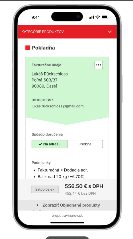
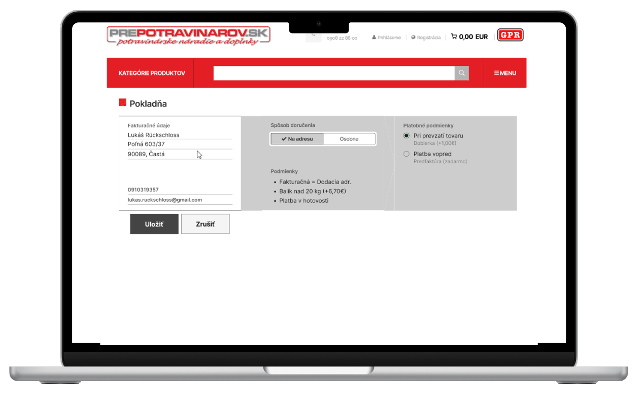
I introduced a horizontal stepper layout, showing each stage of checkout at the top of the screen.
Users could now jump back and forth — edit their billing address, switch shipping methods, or view item details — all without leaving the flow.
This enabled to make the design more clear, since unnecessary details can be hidden for a personal pickup scenario.
TESTING PHASE
The Hidden Stops in a Clear Path
To validate the new checkout experience, I tested three key areas with six internal participants in a moderated in person study.
While completion rates were generally high, the tests revealed critical blind spots — not in logic, but in visibility and user expectations.
“Even in a structured layout, important choices can hide in plain sight.
Usability isn’t just about completion — it’s about clarity and confidence at each step.”
Prompt 2: Change billing address to company
This way of changing the form of billing proved to be a bad design decision. Users simply ignored the hint rollout like it was invisible.
Completion rate: 2/6 completed
*Successful completion only on mobile.
Prompt 3: Change delivery to pickup
The switcher method was highly effective, users approved the way layout simplified after toggle.
Most of them however ignored the copy when asked about it.
Completion rate: 5/6 completed
Prompt 1: Add another delivery address
While most users completed the task, none of them expected at first to hover/click on “+ button“.
Completion rate: 5/6 completed
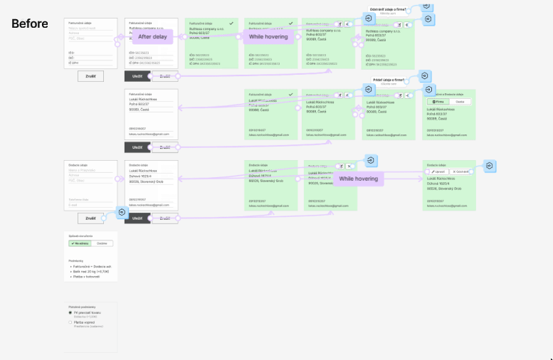
Key changes
How feedback reshaped the final flow
The person/company switcher
Replaced hidden billing switch with an animated toggle.
Now behaves like a natural part of the form — not a separate setting.
Moving the “add delivery address” action
“+” button moved it into the “Delivery method” section as a link-style button — small, subtle, but with animation to guide the eye.
💡 The most complex change?
The billing section.
Technically, the switcher kept conflicting with other prototype logic — so I had to manually reenter the visibility states and interaction rules.
It wasn’t a design challenge. It was a mental model challenge disguised as Figma work.
Real-time shipping and payment feedback
implemented two persistent info rows, dynamically updated as selections of delivery method change.
PROTOTYPING LESSONS
Designing the Invisible Logic
Originally, I intended this prototype to cover only the checkout flow.
But during design, I realized that users needed context — so I built the full path
from cart to payment. You can test the whole flow in prototype.
Let´s move on how the checkout was actually buit.
💡 Unexpected upside
Thanks to Figma’s AI, I no longer had to rename layers by hand —
a tiny relief that made a big difference in keeping things organized.
Focusing on checkout - I made each step/block modular:
Billing, shipping method, delivery info, and payment were designed as standalone logical blocks — reusable and easy to iterate on.
What didn’t go smoothly
The logic of the billing section — especially switching between person and company — became messy after redesign and testing.
Because some interactions conflicted when copied, I had to manually rebuild them.
Interestingly enough, I was able to simplify
- using less cards and less interaction points.
Figma didn’t limit me — but it reminded me that prototypes require thorough planning, not just moving nodes.
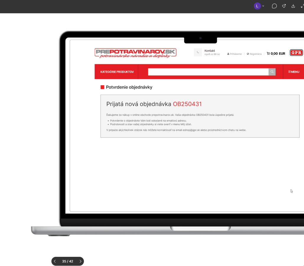
THE RESULT
See It in Action
This was my UX initiative — from research to prototyping. Built with a modular system, responsive logic, and real user feedback.
I suggest to try out the final prototype. If for some reason inline prototype won´t load, you can still view it in a new window.
REFLECTIONS
What I Didn’t Expect to Learn
This project started with curiosity — and ended as a real education.
At first, I planned a straightforward redesign, backed by a SWOT and some user interviews. But once I added a heuristic analysis, my understanding of friction deepened.
I began to see how small inconsistencies — missing feedback, passive toggles —
weren’t flaws, but opportunities to build trust.
As a designer, I was reminded that no matter how many edge cases I imagine,
testing always shows me the ones I miss. And it’s humbling — in a good way.
“One of the most surprising moments came during a session with our oldest participant — a man in his 60s, who completed all tasks effortlessly.
It was a quiet reminder that bias isn’t just visual — it’s cognitive.”
THE IMPACT
From Prototype to Pitch
After completing the prototype and usability study, I presented the project directly to the CEO of the company.
I began by explaining my motivation, supporting data, and user context — and followed with an interactive walkthrough in Figma.
Though I was nervous at first, I wasn’t alone.
A colleague who supported me throughout the process joined the presentation. His live comments added weight to the work — and reminded me this wasn’t just a concept. It was a solution others could stand behind.
The clarity of the layout, modular flow, and reasoning behind each design decision resonated.
The project was approved.
Next, we’re entering discussions with our external system provider to explore how the concept could be implemented into our actual e-shop platform.
My thanks goes to my colleague at a time - Ján “Janči“ Chovanec for his support and insights.
THE IMPACT - update
From Pitch to Production
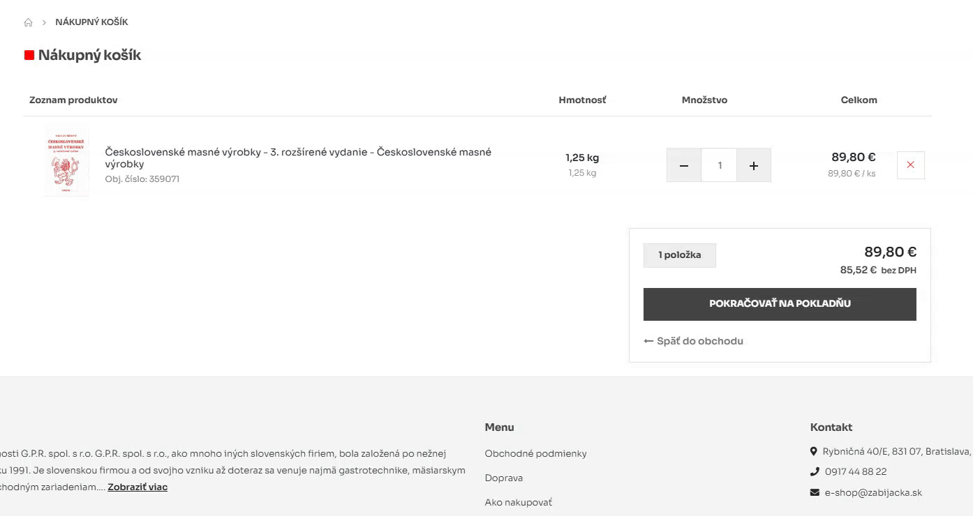
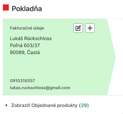
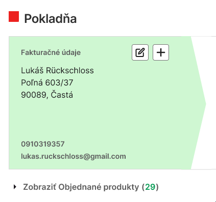
The Checkout 2.0 design went live on zabijacka.sk as of November 2025, becoming my first UX project that made it into real production.
About 90 % of my original design was implemented — with the remaning 10% adjusted through collaboration with the developer to fit system limits.
At launch, I expected one risk: that hiding the payment options when “Personal pickup” was selected might confuse users.
But the next day proved otherwise — customers kept ordering both for delivery and pickup without friction.
The result? A clear, reliable checkout flow that worked just as intended in the real world.
Next step is to implement the design into prepotravinarov.sk to ensure that customers comming onto a GPR eshop/online store can always expect familiar way to place an order.