Journey from one suspicious metric to redesigning a key conversion point
Minute and a 20 question marks
ROLE
Product Designer
Visual Designer
SKILLS
Wireframing
Prototyping
Usability Testing
TIMELINE
Q2 2025
A QUICK SUMMARY
When data didn’t match behavior
I initiated this project while working for an e-commerce company. After noticing that even registered users were spending 1 minute and 20 seconds in the checkout — despite already being logged in — I decided to investigate.
At first, I wanted to speed things up. But after conducting a SWOT analysis and running a heuristic evaluation, I reframed the problem:
Maybe the issue wasn’t speed. Maybe it was about giving customers a greater sense of control — clearer steps, better feedback, fewer surprises.
I took on the full process: from initial research and analysis, to interface design, component building, and prototyping in Figma.
The result is a structured and testable prototype — with usability testing currently underway.
Once complete, I plan to present the work to company leadership as a proposal to enhance the buying experience for our customers.
If you’d prefer to see the case study in a different format, a slide deck version is available.

THE HYPOTHESIS
What I Expected…
I’ve spent a lot of time with this e-commerce platform — I know how checkout should behave, and how it usually performs.
So when I saw that even logged-in users were spending more than a minute in the final step, I assumed something had gone wrong.
My Hypothesis:
“There’s a friction in the interface — and it’s costing people time.”
Maybe…
…something was unclear.
…the layout wasn’t helping.
…people simply didn’t trust what they were seeing.
RESEARCH AND UX AUDIT
…And What I Didn’t Find
To test this, I first ran a SWOT analysis to map strengths, weaknesses, and potential causes.
Then I moved forward with two methods with a combined goal to uncover dificulties both from a user and professional perspective.
Together, they revealed a different story.
User Interviews
5 new and 5 reccuring customers
7 questions mapping users behavior
Qualitative method via phone call
Heuristic UX audit
Jakob Nielsen´s Heuristics for UI
Manual checkout test
Notes from users comparison
TALKING TO USERS
“Whatever it is, the way you tell your story online can make all the difference.”
Reading Between the Lines
No major blockers were reported.
But hesitation showed up in behavior — subtle pauses, repeated reading, last-second adjustments.
HEURISTICS COMPARISON
What People Didn’t Say
System status visibility
User control and freedom to go back
Recognition rather than Recall
Minimalist design
Error prevention
Real world match
Consistency and Standards
Flexibility of use
Help Users Recognize, Diagnose etc.
Help and Documentation
Five major flaws revealed by the audit:
Problematic visual hierarchy
Poor mobile optimalization
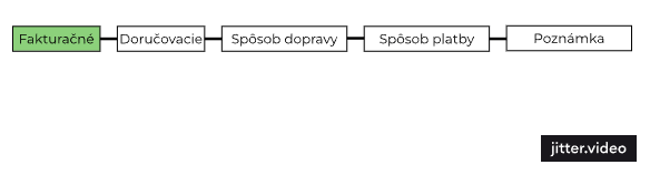
Linearity of steps/No obvious way to go back
Missing help fields
No way to return to previous step after going back to eshop
These details weren’t obvious failures — but they explained the time.
Not technical friction. Cognitive friction.
THE PROBLEM
Not a Technical Friction
The interface worked. Orders were comming in. But there was something missing:
Confidence.
This was a turning point for the project.
Instead of trying to speed things up, I focused on helping users feel in control — every step of the way.
MY SOLUTION
Title
Some details
Title
Details
Title
Details
More details
Title
Details
TESTING PHASE
Title
Details
“A curious quote”
Key changes
Title
Title
Details
Title
Details
Title
Details
PROTOTYPING LESSONS
Title
Details
“Interesting quote”
Title
Details
THE RESULT
Title
Details
REFLECTIONS
Title
Details